Responsive Photobook
Responsive Photobook
Although it was initially designed for creating photo books, its power and versatility have led us to adopt it as our generic editor for most products.
We will explain the different ways to use it and the basic concepts needed to get the most out of the editor’s full power.
Templates and Model’s template
The first thing to learn to design a product with the “Responsive Photobook” editor is the difference between a product’s Template and its Model.
Template
It is the set of physical, editing and printing properties of the product, such as the print size, number of pages, prices, output format or automatic or manual editing mode.
We create it by clicking on the “Create” button in the “Product Templates” section on the editor’s administration screen and selecting the “Responsive Photobook” option.
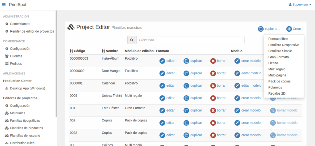
By clicking on the selection, a pop-up window will open with all the template configuration options.
Model
It is the design associated with a template that the end-user will be able to personalize. It is not necessary for all templates to have an associated model.
For example, if we want to offer a blank photo book to the user and let them create and personalize the design, a model will not be necessary.
But if we want to offer the user an initial design as a starting point, or create complex products with specific designs and scenes, then a model will be necessary.
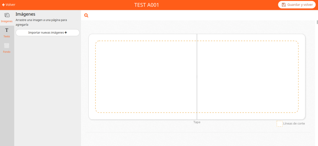
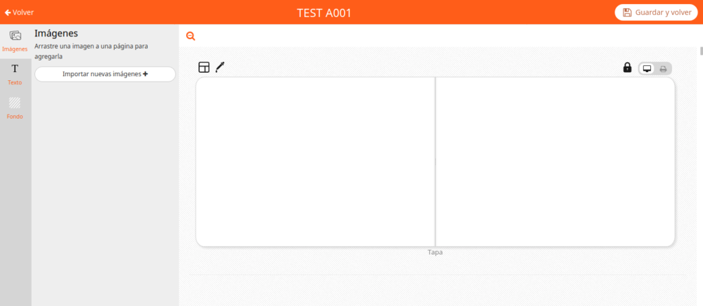
To create a model, a template must first exist. Once the template is created, you have to click on the “create model” button to open the editor and start creating our design.
When we finish, we click on “Save and return” to go back to the template manager.
That’s why it is important that before starting to work on the model we are clear that the template format is the correct one.
We will know that the model has been successfully created because next to the template the “edit model” button will appear instead of the “create model” button that appeared before.
If we delete the model, the “create model” button will reappear. Each template can only have one associated model.
Here is another video with the explanation of the difference between model and template
Components
They are the elements that determine the type of product we are going to design.
We find them inside the template configuration window, by scrolling down to the section called Components.
By default, the system creates the two necessary components to create a photo book: a Cover type called Cover and a Pages type called Pages.
There is a third type of component called Generic that we will normally use to create object type products (t-shirt, mug, posters, gifts, etc.).
The components can be deleted using the cross-shaped button that appears to the left of the component name, and added using the “add” button on the right side of the window.
If you cannot delete a component, it is because a model has been created.
In this case, it would be necessary to delete the model to eliminate the component.
We will detail them one by one but so that it is not repetitive, the sections Screen Design / Backgrounds / Output File will be explained for all components.
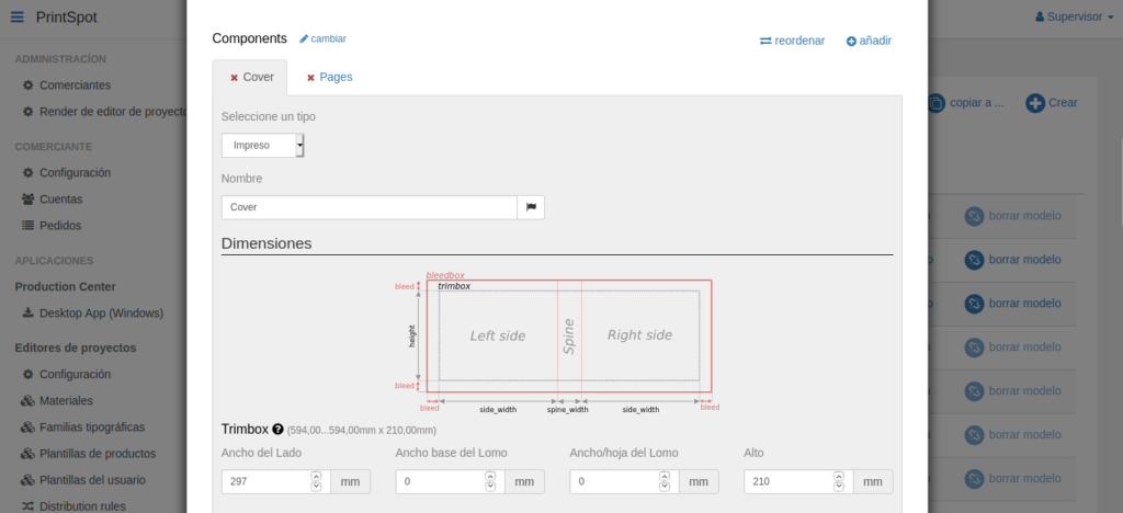
Cover Component
This is the component we use to create the cover of a photo book type product, although it can also be used to display relevant information for the end user in any other type of product (for which we should select the “Not printed” type).
If we configure a Cover type component, in addition to the name we want to give it along with its translations, we will be asked to configure several sections specific to this component (Dimensions and Content Layout) in addition to others common to all components (Screen Design, Custom Palette, Backgrounds, and Output File) that we will see later.
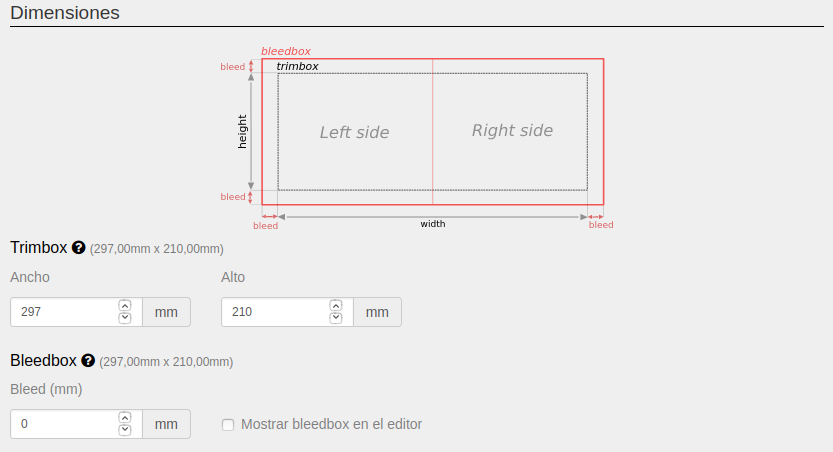
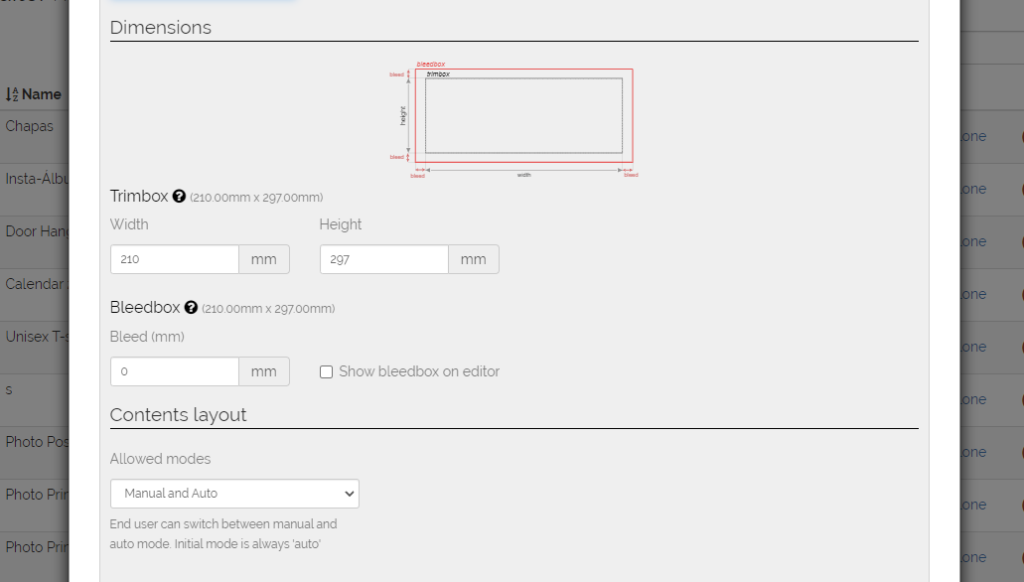
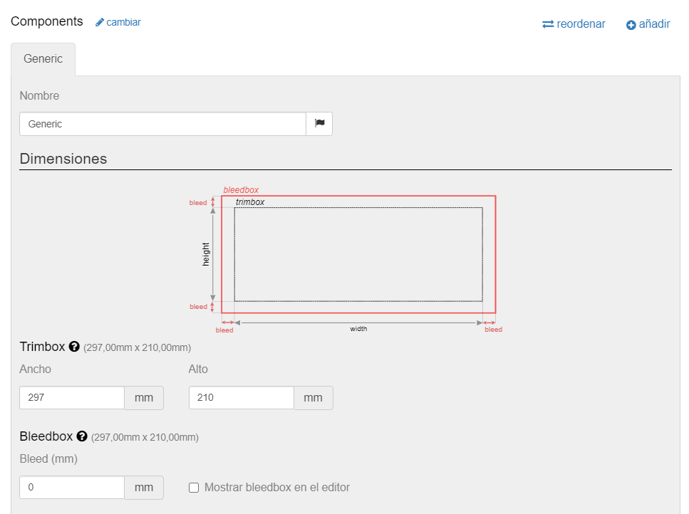
Dimensions
Here the system allows us to configure two sections: Trimbox and Bleedbox.
Trimbox
It is the useful printable area on which the end-user can add their photos and designs.
In the case of the cover component, it is divided into Left side, Spine, and Right side, referring to the different parts of a photo book cover.
The system allows us to configure the following parameters:
- Side Width: width in millimeters of each of the sides of the cover.
If we enter a value of 100 mm for each side, the total width of the cover will be 200 millimeters plus the width of the spine. - Spine Base Width: initial width in millimeters of the cover spine.
If no value is entered for the next field (Spine Width/sheet), this will be the final width of the spine regardless of the number of sheets in the photo book. - Spine Width/sheet: millimeters of width that will be added to the previous value (Spine Base Width) for each sheet the user adds to the photo book.
The total size of the cover is calculated starting from the first sheet of the configured range. - Height: height in millimeters of each of the sides of the cover including the spine.
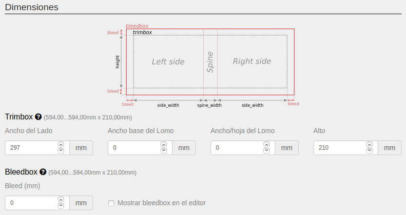
Bleedbox
It corresponds to the bleed of the cover.
It is the area that the system will add around the trimbox to be able to fold the edge of the cover over or avoid white edges when it is trimmed.
The final file that the printer will receive will add crop marks on the bleedbox.
The system allows us to configure the following parameters:
- Bleed: area in millimeters that will be added around the trimbox in the print document.
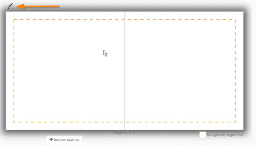
- Show bleedbox in the editor: if we activate this option, when the template is opened in the editor, the system will use the bleedbox as the editable area, and will add a dashed line indicating the trimbox so that the user knows where their photos will be cut.
If, on the other hand, it is left unchecked, the editor will use the trimbox as the editable area and the user will see exactly what they will receive later, even though the final file for the printer will include the bleedbox and the cut lines.
Content Layout
In this section, we will select the editor’s behavior for placing the user’s images.
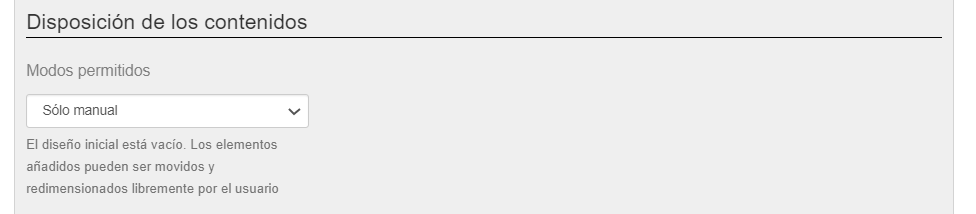
There are three possibilities: Manual only, Automatic only, and Manual and automatic.
- Manual Only: when the user adds an image or a text, the system will position them in the center of the cover, and it will be the user who will size and place them where they want.
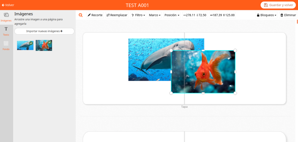
- Automatic Only: when the user adds an image or a text, the system will position them automatically according to an algorithm of pre-established designs that vary depending on the number of images to be positioned.
Once inserted, the user can modify the design, but always choosing from the different designs that the system generates. - Manual and Automatic: when the user adds an image or a text, the system will position them automatically according to an algorithm of pre-established designs that vary depending on the number of images to be positioned.
Once placed, the user can modify the design, either manually or by choosing from one of the designs that the system generates.
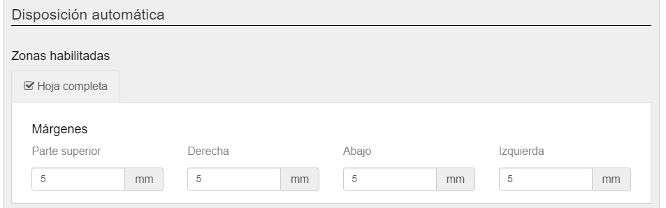
This option is configured in the “Automatic Layout” section that appears further down when we select either of the two modes, where we will have to enable or disable: the spine, the right side and the left side. In the case of the “Manual and Automatic” mode, even if we do not enable any zone, the user will be able to manually place images and texts on the entire cover, and only automatically in those enabled zones.
To enable/disable any of the zones, you have to activate the checkbox that appears to the left of the zone name.
While clicking on the name of the zone what we will do is open its configuration window.
For each zone we can establish the margins that we want the system to respect when generating the automatic designs.
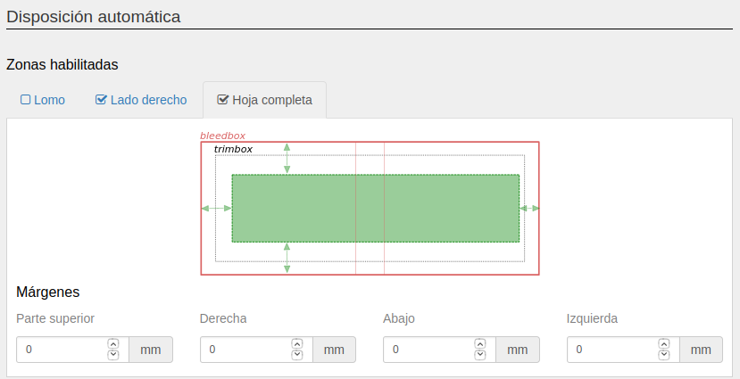
In addition, in this section it will let us add a border to the images, which if we do not want it to appear we will have to leave at 0.
Pages Component
This is the component we use to generate the body of the photo book.
In this case, we cannot select whether it is printed or not, since it will always be printed.
Number of sheets
The first thing to take into account when configuring this component is the number of pages we want it to contain.
This is configured within the Variants section, just above the Components section.
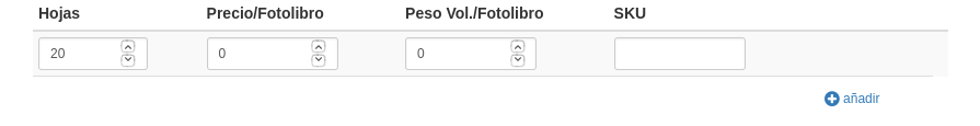
Here we will have to configure the possible number of sheets that the photo book can have.
By default, the system comes configured with 20 sheets at a price of 0. This means that the user can only create photo books with 20 sheets and it would cost them 0. If we enter a price, this will be the cost of the photo book.
Using the “add” button we can add as many possible numbers of sheets as we want.
If we click it a first time, the system will add another line with 40 sheets at a price of 0.
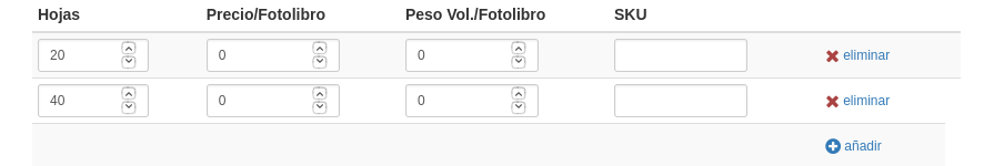
With this configuration, the user could finish the photo book with 20 sheets or with 40, but not with any intermediate value.
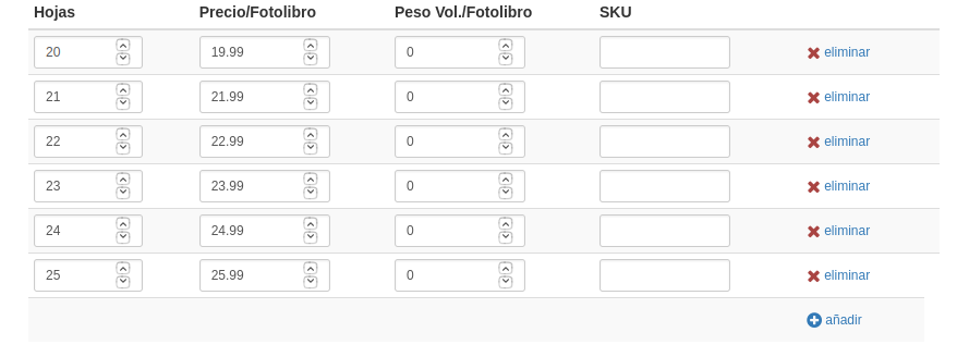
The system will allow them to add as many sheets as they want until they reach 40, and if they try to finish the order with an intermediate number (e.g.: 26), it will urge them to either delete or add sheets until they reach 20 or 40. If we want the system to allow the user to choose between a whole range of sheets between two values, we will have to configure the different possible numbers with their corresponding prices.
This is what it would look like if we wanted to offer the user all possible numbers of sheets between 20 and 25 at different prices:
A photo book with 12 sheets will have 24 pages, one with 20 will have 40, etc.
Dimensions
Once the number of pages has been selected, we will have to configure the dimensions of the pages.
Here the configuration screen is similar to the case of the cover component, with the difference that the width it asks for is per sheet and not per page and that it does not ask for the size of the spine.
Trimbox
It is the useful printable area on which the end-user can add their photos and designs.
In the case of the pages component, it is divided into “Width” and “Height”, referring to the dimensions of the photo book sheets.
The system allows us to configure the following parameters:
- Width: width in millimeters of each of the photo book sheets.
It must be taken into account that each page will have a width of the value we enter here divided by two.
That is, if we enter a value of 600 mm wide, each page will have a width of 300 mm.
IMPORTANT: it is necessary to take this into account when it comes to matching the sizes of the sheets with those of the cover, since in the cover section we enter the value of “width per side”, which is the equivalent of the “width” of the sheet divided by two (pages) of the pages component.
- Height: height in millimeters of each of the sides of the photo book sheets.
Bleedbox
It corresponds to the bleed of the cover.
It is the area that the system will add around the trimbox of the sheets to avoid white edges when it is trimmed.
The final file that the printer will receive will add crop marks on the bleedbox.
The system allows us to configure the following parameters:
- Bleed: area in millimeters that will be added around the trimbox in the print document.
- Show bleedbox in the editor: if we activate this option, when the template is opened in the editor, the system will use the bleedbox as the editable area, and will add a dashed line indicating the trimbox so that the user knows where their photos will be cut.
If, on the other hand, it is left unchecked, the editor will use the trimbox as the editable area and the user will see exactly what they will receive later, even though the final file for the printer will include the bleedbox and the cut lines.
Content Layout
In this section, we will select the editor’s behavior for placing the end-user’s images.
We will find the same options as in the case of the cover component, with the difference that here we will have some extra important configuration options.
These are again the three editing modes that the system offers, and they have the same operation as in the case of the cover component: Manual only, Automatic only, and Manual and automatic.
In addition to this, and regardless of which of these modes we select, we will be offered to configure the following fields:
First and last page lock
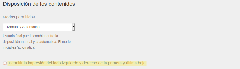
By activating the “Allow printing on the left and right side of the first and last sheet” checkbox, we will be allowing the end user to be able to add images and texts to the first and last page of the photo book.
While if we deactivate it, we block both pages.
Initial number of sheets
In this section, we will configure how many sheets should be offered to the user once they start editing their photo book.
There are three possible modes. Two of them are always available: “All possible sheets” and “Predefined number of sheets”, and a third one only available for the “Automatic Only” and “Manual and Automatic” content layout modes.
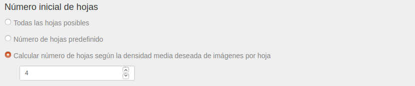
For all modes:
- All possible sheets: when the user starts editing their photo book, the system will offer them the maximum possible number of sheets according to the options configured in the template (see Number of sheets section)
- Predefined number of sheets: the system will try to open the photo book with the number of sheets indicated here.
If the indicated number does not correspond to any of the options configured in the Number of sheets section, the system will use the configured option that is closest.
Only for “Automatic Only” and “Manual and Automatic” modes:
- Calculate number of sheets according to the desired average image density per sheet: the system will calculate the number of sheets that the photo book should have from all the options configured in the Number of sheets section so that the average number of images per sheet is as close as possible to the number entered here.
Standard Layout and Custom Layout
This section is only activated for the “Automatic Only” and “Manual and Automatic” modes, and it allows us to choose and configure two different ways of automatically placing the photo book contents.
Watch the following video to better understand how manual and automatic layouts work:
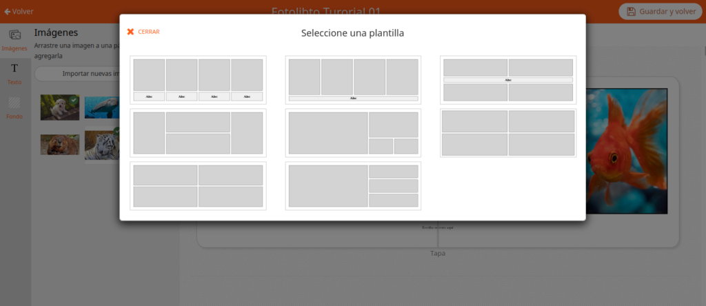
Standard Layout
The system will automatically position the user’s images and texts following an algorithm that, depending on the number of images and texts a sheet contains, will offer a series of predefined designs.
In the standard layout mode there are some parameters to configure.
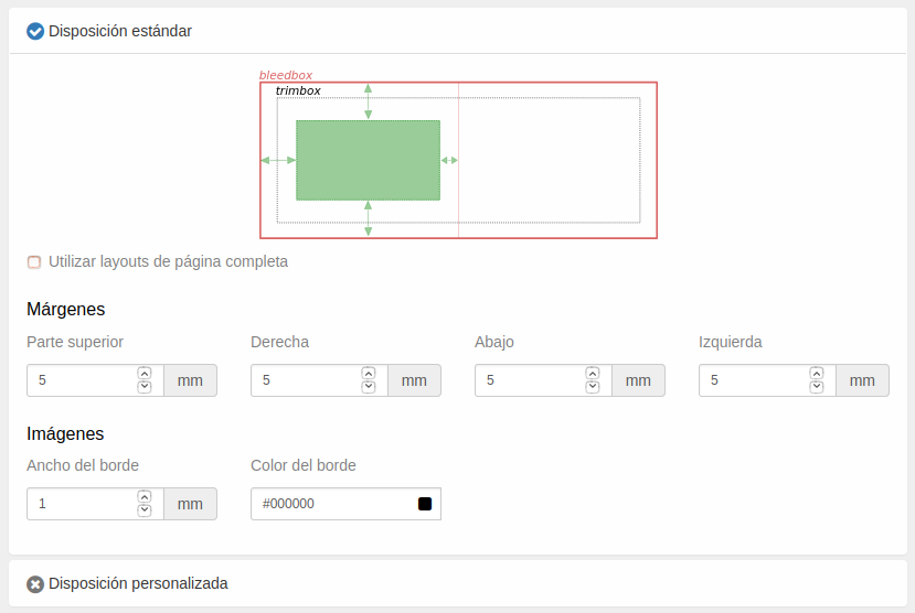
First, we are asked if we want to “Use full page layouts“.
If we activate this option, the designs generated by the system will not distinguish between the left and right pages, but will treat the sheet as a whole, being able to place elements in the center of the sheet (between the two pages).
While if we deactivate it, the system will distinguish between the left and right pages and will generate designs that do not place elements between them.
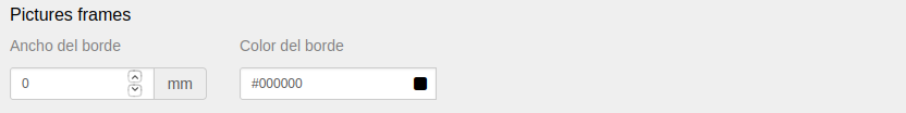
Second, we are given the possibility to establish the “Margins” with respect to the borders that we want the system to respect when generating the automatic designs.
And finally, it allows us to configure the thickness and color of the border that we want the system to add to the “Images” of the photo book.
If we do not want any border to be added, we just have to leave the “Border width” at zero.
Custom Layout
If we select the “Custom Layout” option, we will be telling the system that, in automatic modes, it should not place the photo book elements according to the automatically generated designs, but according to the designs that we can configure in this section.
In the case of not having selected the previous option “Allow printing on the left and right side of the first and last sheet”, the system will offer us three tabs: one for the “First sheet” (the right page of the first sheet, since the left one is locked), another for the “Inner sheets” (each containing a left and right page) and a “Last sheet” (the left page of the last sheet, since the right one is locked).
If the option “Allow printing on the left and right side of the first and last sheet” has been checked, the system will unify the three tabs into one, since the distribution of editable pages per sheet will be the same for the entire photo book.
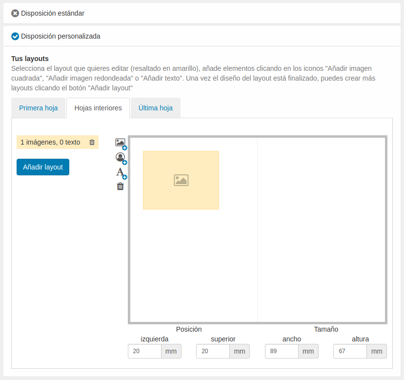
In any case, the system offers us a mechanism to create our own designs, which it will call “layout”.
By default, the system will generate a first layout with 1 image and 0 texts.
The “Size” and “Position” of the image can be seen in the viewer on the right side of the screen.
To modify them, simply edit the “left” and “top” fields for the “Position”, and the “width” and “height” fields for the “Size”.
Once the image is located where we want it and has the appropriate size, we can add another square image, round image or text using the buttons on the side of the viewer.
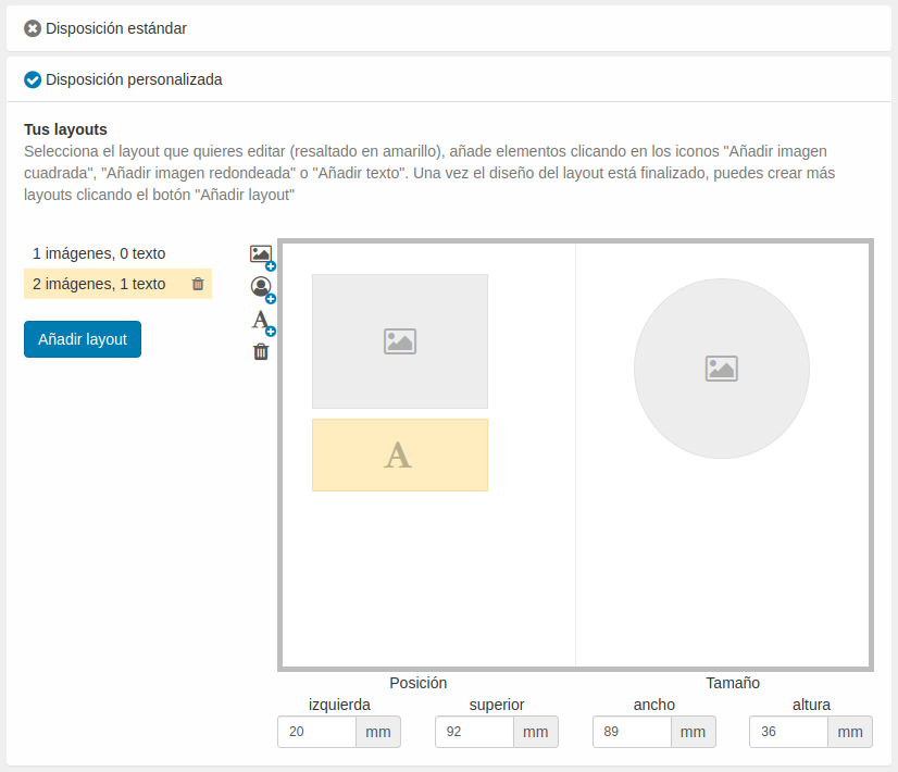
We can add as many layouts as we want using the “Add layout” button, edit the existing ones by clicking on each of the existing ones, and delete them by clicking on the trash can icon.
That is, if you want to offer a layout with 1 image and another with 3, you will also have to create a layout with 2 images.
This is so, because the system will offer the user the different layouts based on the number of images that each sheet contains, and if they add a new image to a sheet, they will only be able to position it if there is a layout that supports it.
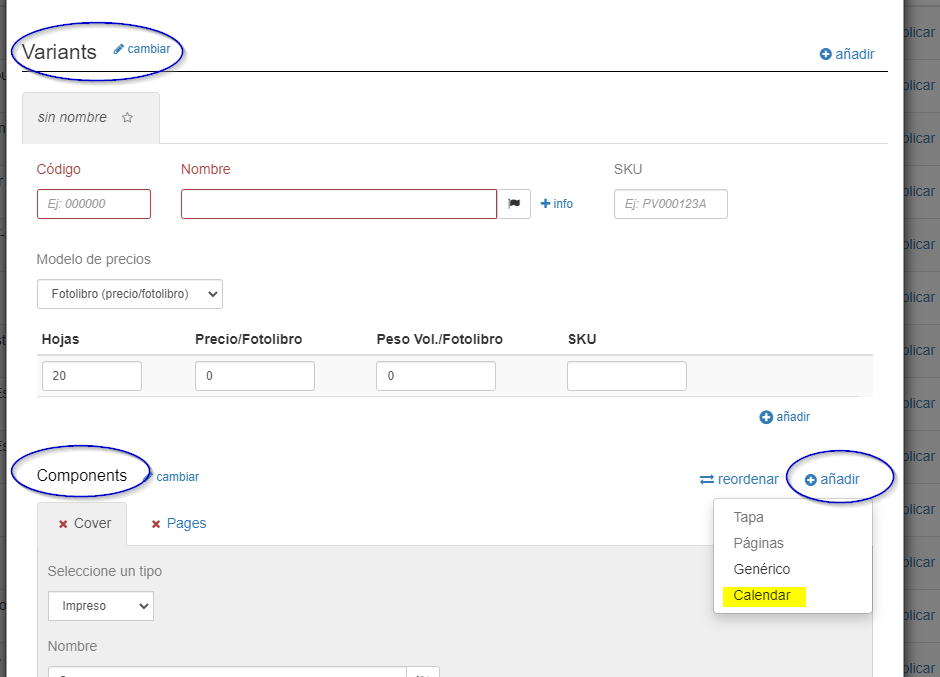
Calendar Component
Forget about creating tables and create multiple calendars to sell and personalize in minutes!
At Imaxel we are in constant evolution and we always take into account the requests of our customers.
That is why we have developed a new component for the creation of automatic calendars for sale and online personalization.What can we configure in our calendar product for sale?
- All the features already available for all our products (print area, bleed, pages, etc…)
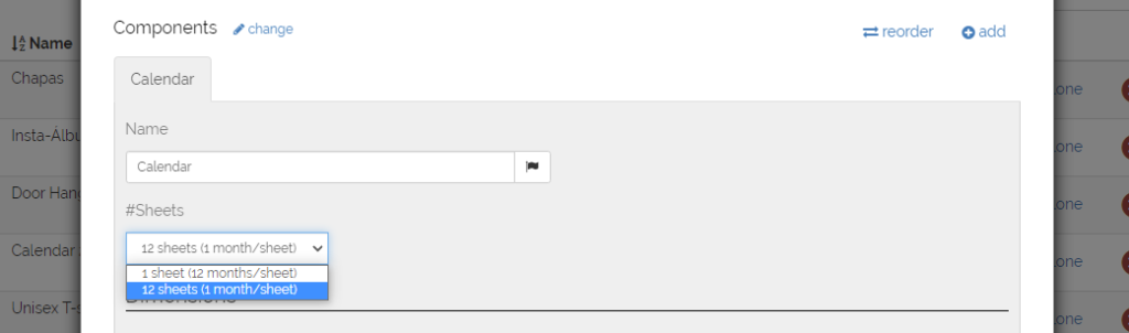
- Calendar type: 12 months on one sheet or 12 months on 12 sheets.
- Layout of the calendar space and customizable space with photos and texts.
- Font sizes, margins and colors.
What can our customers do with the automatic calendars?
- Select +30 languages
- Configure date
- Automatically add holidays
- Add photos and text
- Choose from different backgrounds
- Choose from different photographic layouts
Here we show you how to create an automatic calendar with this component:
In the Components section below Variants, we click the add button and then we click on Calendar to add a calendar component to the template:
We can choose between two types of calendar options.
- A summary one that will have a calendar of 12 consecutive months on a single page.
- The other option is 12 pages with one consecutive month per page.
In both options we will have to configure our trimbox and our bleed.
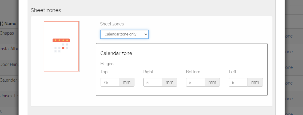
Continuing with the configuration, we will be able to choose between a 2-zone layout (Calendar + Photo) or a 1-zone layout (calendar only).
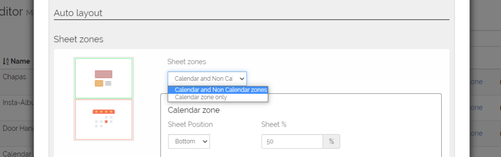
With the 2-zone option (calendar + photo) we will be able to choose where we want each zone to be (top, bottom, left or right) and its size.
In turn, we will be able to adjust, independently, the safety margins of the two zones.
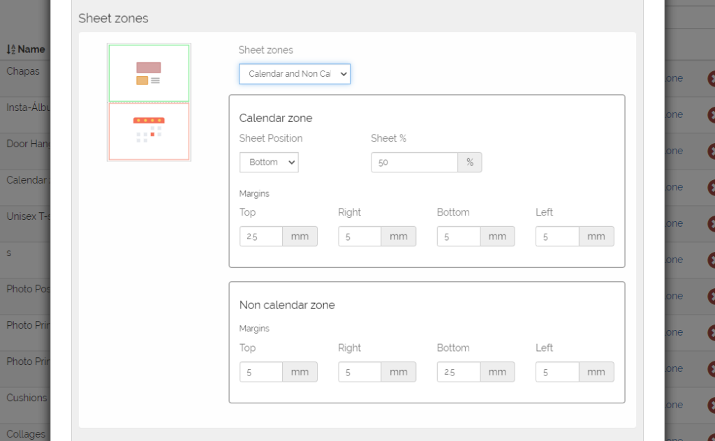
If on the other hand we want to make a calendar of a single zone that occupies the entire page, we will only be able to adjust the margins of said zone.
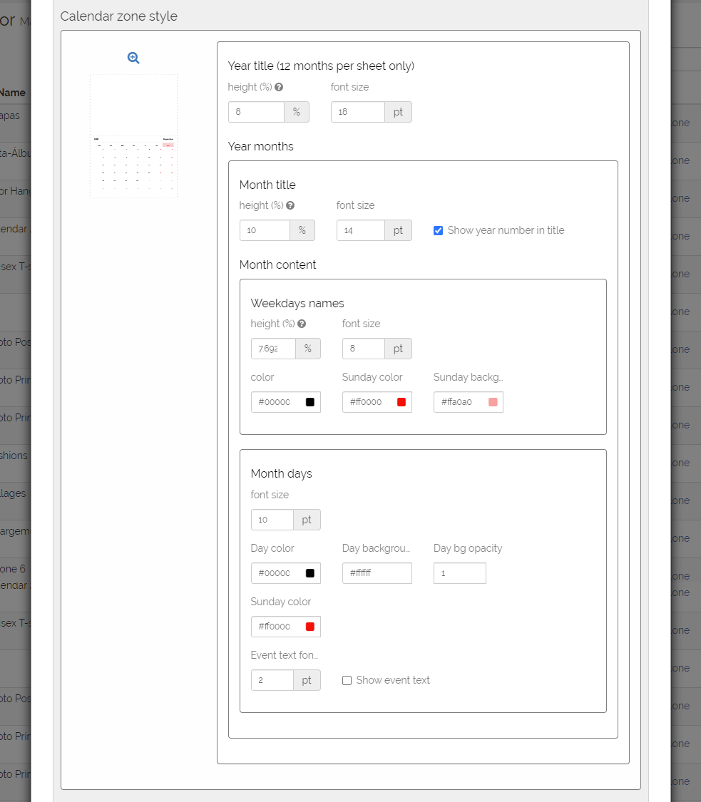
Continuing with the configuration, we are going to personalize our calendar.
We have the option (only in calendars with 12 months on one sheet) to adjust the space for the title and its size.
This title will be the year and selected first month + year and selected last month.
We can also define the space and font size for the month title, as well as choose whether or not we want to show the year in the month title.
On the other hand, we will also be able to configure the space and font size of the names of the days of the week.
In this case, we can also define a color for normal days, and a different one for holidays and their respective background.
Finally, we can also configure the days of the week in font size, color and background of a normal day and color and background of a holiday.
The last option we have is to choose whether we add the texts of the holidays and the font size.
This new component can be combined with other components such as Cover or Pages to form different types of calendars.
In summary, this component coexists with all the options offered by the Responsive Photobook editor such as choosing the output format, adding backgrounds, etc…
FAQS
What year is the default in the calendar component?
The default year that will be shown in the calendar will depend on the current date.
If the current date is before October 1, the default year will be the current year.
If, on the contrary, the current date is after October 1, the default year will be the year after the current year.
Even so, we remind you that the user can choose the year at all times, as well as other features (the language used, holidays that appear, etc.) when they open the calendar and the window with different calendar configuration options appears.
If it has an associated model, you must enter the model, change the year and save the changes.
If you want more information about what a model is and how it is managed, click here.
I want to show the holidays of a specific place and they are not available. What should I do?
Our system is powered by an extensive database of practically all the holidays in the world, however, it is possible that some holidays, such as autonomous or regional holidays in some country, are not available.
If this is the case, we are prepared to add them without any problem, you just have to contact us at soporte@imaxel.com and tell us which holidays you want to add.
Generic Component
The generic component can have different uses.
The most common cases are:
- Cover for photo book in combination with the Cover and Pages
- Sheet of additional information to the photo book that can be configured so that it is not printed
- In products that are not photo books, they are used for personalizing objects that need a scene as a graphic representation.
In this case it is possible to configure it without having to configure a range of sheets.
Dimensions
It is necessary to configure the dimensions of the page.
Here the configuration screen is similar to the case of the cover component, with the difference that the width it asks for is per sheet and not per page and that it does not ask for the size of the spine.
Trimbox
It is the useful printable area on which the end-user can add their photos and designs.
In the case of the pages component, it is divided into “Width” and “Height”, referring to the dimensions of the photo book sheets.
The system allows us to configure the following parameters:
- Width: width in millimeters of each of the photo book sheets.
It must be taken into account that each page will have a width of the value we enter here divided by two.
That is, if we enter a value of 600 mm wide, each page will have a width of 300 mm.
- Height: height in millimeters of each of the sides of the photo book sheets.
Bleedbox
It corresponds to the bleed of the cover.
It is the area that the system will add around the trimbox of the sheets to avoid white edges when it is trimmed.
The final file that the printer will receive will add crop marks on the bleedbox.
The system allows us to configure the following parameters:
- Bleed: area in millimeters that will be added around the trimbox in the print document.
- Show bleedbox in the editor: if we activate this option, when the template is opened in the editor, the system will use the bleedbox as the editable area, and will add a dashed line indicating the trimbox so that the user knows where their photos will be cut.
If, on the other hand, it is left unchecked, the editor will use the trimbox as the editable area and the user will see exactly what they will receive later, even though the final file for the printer will include the bleedbox and the cut lines.
Content Layout
In this section, we will select the editor’s behavior for placing the end-user’s images.
We will find the same options as in the case of the cover component, with the difference that here we will have some extra important configuration options.
These are again the three editing modes that the system offers: Manual only, Automatic only, and Manual and automatic.
In the cases of Automatic and Manual and Automatic, the Enabled Zone appears to be selected along with the editing margins
Screen Design
For the Cover & Pages components, we will configure the option to show the fold lines and, if necessary, show the product with rounded corners on the cover and sheets.
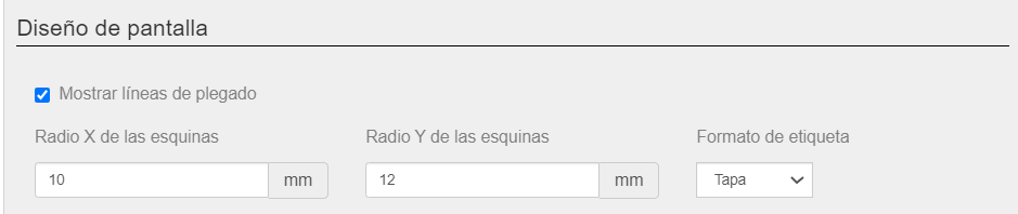
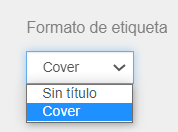
The Label Format that is shown on the screen below Cover in the editing screen has two options: Untitled that shows nothing or the value of the text that we have indicated in the Name of the component, taking into account the value of the text entered in the translation-
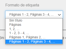
The Label Format that is shown on the screen below the Pages in the editing screen has two options: Untitled that shows nothing or the value of the text that we have indicated in the Name of the component, taking into account the value of the text entered in the translation.
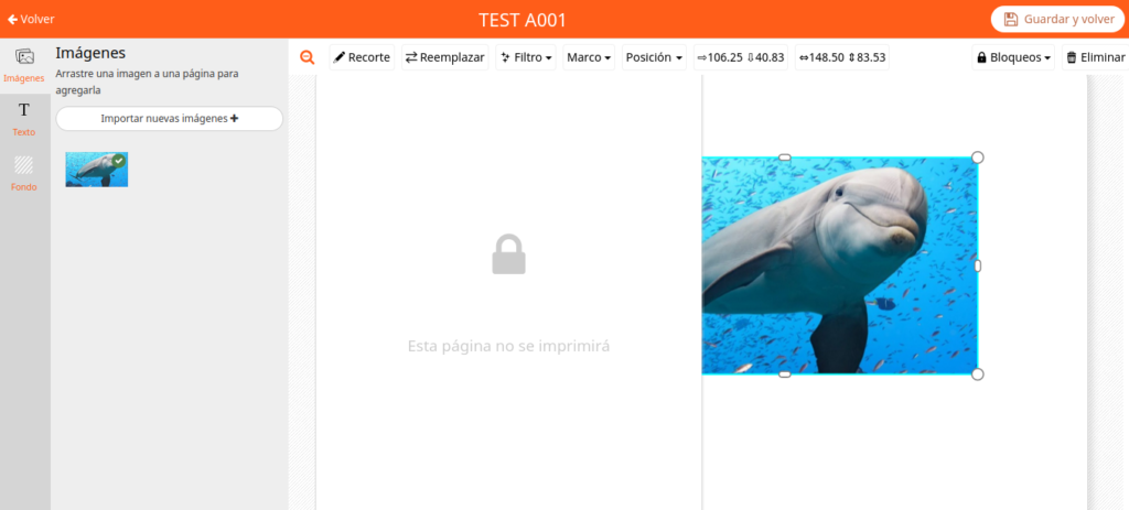
In the Generic Component, the possibility of having a Scene Design is added.
This is a graphic resource that helps us show the product on screen in a more realistic way.
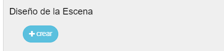
If we click on Create, a window appears in which a graphic file can be attached in which a green area will automatically be added, as if it were an image layer, so that the editor can show the space to insert the image on the screen.
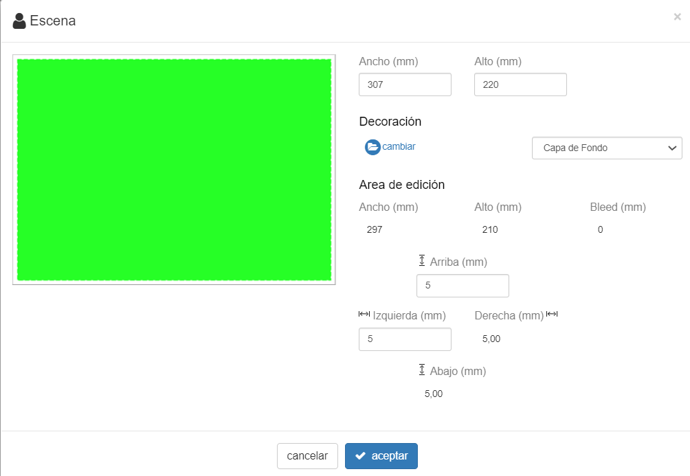
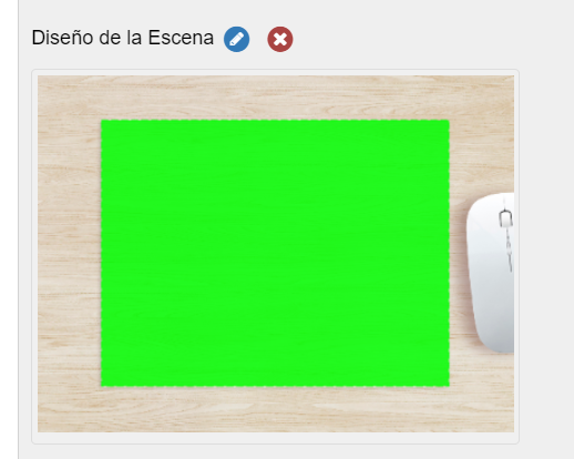
The product would be seen in the editor in the following way:
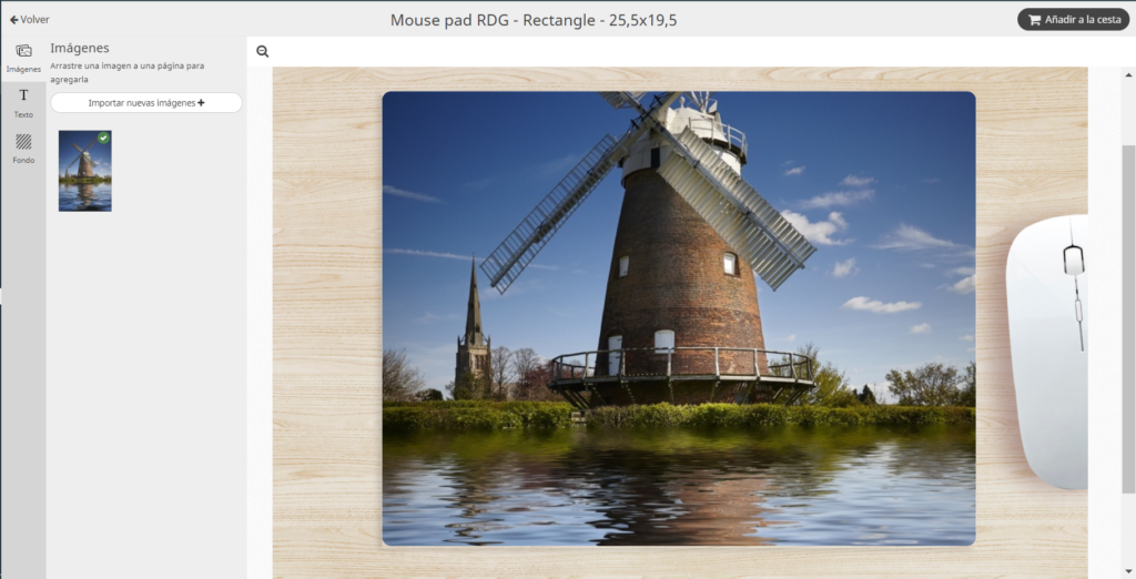
The file that will be received for printing will only be the image that we have used to personalize our product.
Graphic files of the scene are not received.
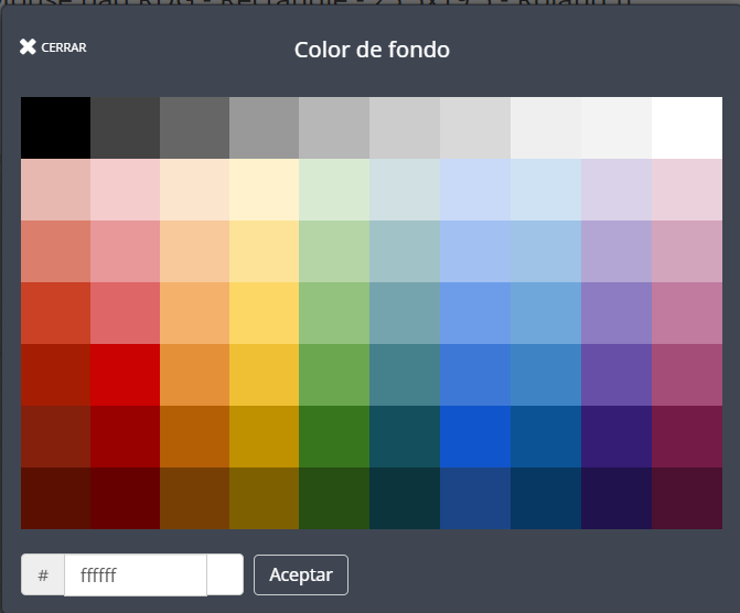
Custom Palette
The editor has a default color palette for the different Components: Cover – Pages – Generic, with a range of Background Colors.
These colors are applied in the editing screen to the corresponding component.
From the configuration screen you can personalize the colors to be shown if you are not interested in showing them all.
Therefore, in this section we can define the colors #RRRGGGBBB and the order in which they are shown on the screen.
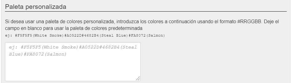
Each Component has the possibility by default of changing the background color; you could have different custom palettes for each component.
In the next section, the operation of the backgrounds section is explained
Backgrounds
In this section it is possible to use JPG or PNG image files to use them as a background for any Component created.
It is possible to create as many backgrounds as you need by clicking the “Create” button.
You have to keep in mind that the first background that is configured will be the one that is the default in the editor.
Each created Background can be edited individually, deleted and dragged and moved to determine the order of appearance in the editor.
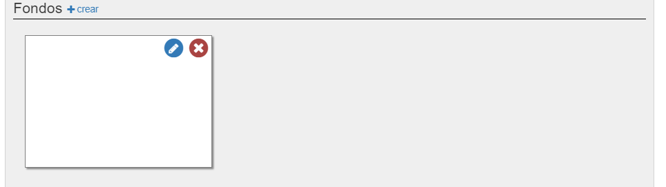
To personalize the background, we will click on the edit icon
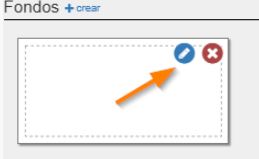
and it will show the following window
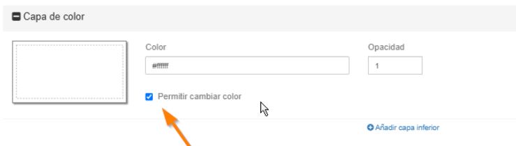
In this way, when you enter the front of the variation you are in, if you hover over a page, this icon appears that allows the user to change the background color
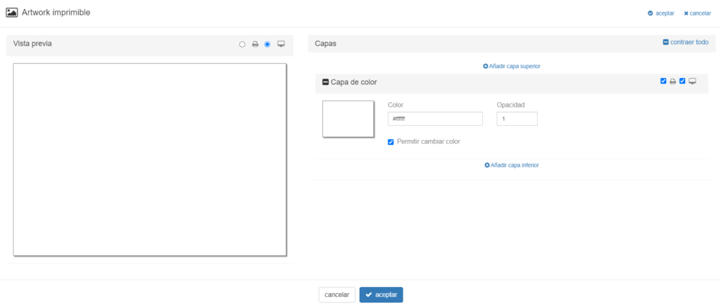
The window is divided into two parts.
On the left side it shows how the created background will look in the on-screen editor and how it will look when printed.
To do this, we will select the screen or printer icon.
On the right side you can configure Image and/or Color Layers to apply to the Background.
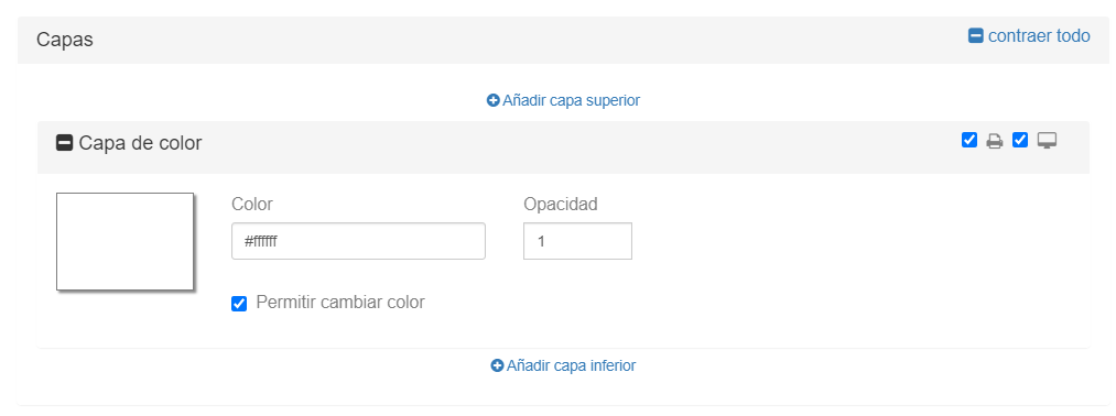
Each layer has a selector where you configure whether it is used in the product design to be shown on screen only and/or to be printed.
It must be configured with the printer and screen selector.
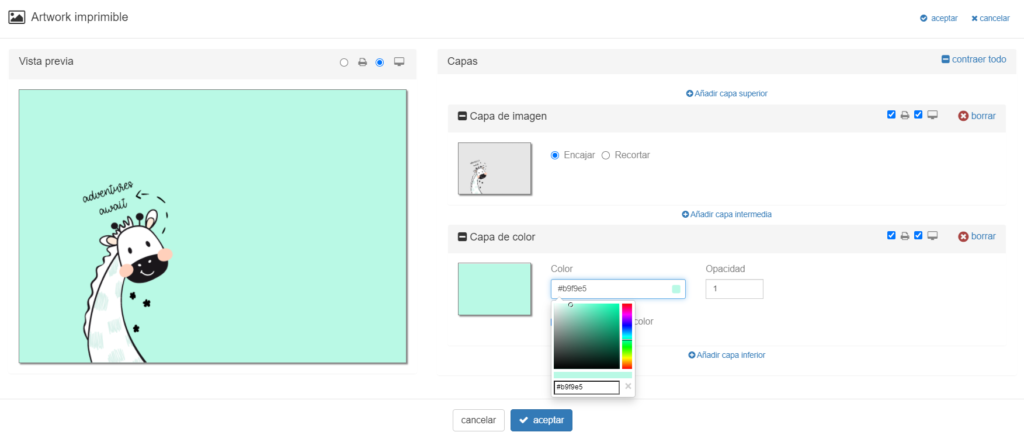
In the example used we see that we have used a background with a png image in the top image layer and at another level an editable color layer that can initially be defined with the background color palette and opacity.
This graphic material is shown in the editor on the right side of the screen in the Backgrounds section.
Here we show you an example of creating a template for a button product with the generic component
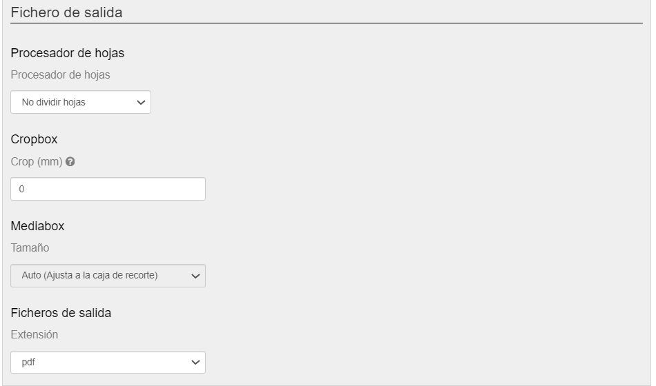
Output file
For each component you have to configure the type of output file that is needed
-
Sheet processor
The editor works by default with print sheets, therefore sometimes for printing needs it is necessary to divide the sheet into two pages.
The options available with the Sheet Processor are two:-
Do not split sheets
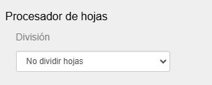
In this case, the output file will be the one defined in the size of the sheet.
Using as an example a sheet that had these dimensions: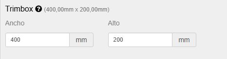
400mm wide by 200mm high The output file would be like the following example:
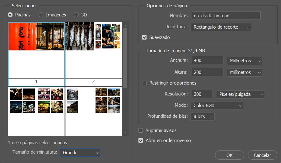
A PDF with all the sheets, each one 400×200 mm -
Split sheets into two halves
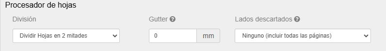
In this case, the output file will be the one defined in the size of the sheet divided by two.
Using as an example a sheet that had these dimensions:400mm wide by 200mm high The output file would be like the following example:
A PDF with all the pages, each one 200×200 mm (half the size of the 400x200mm sheet) Within this option, we can configure the Gutter.
The Gutter is the margin that is on the inner side of the page, closer to the spine of the book.
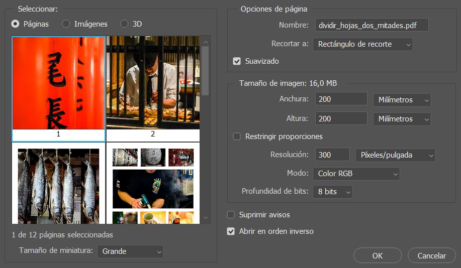
This margin is the most important to take into account when we talk about binding, since if it is too narrow, the text or content can be trapped in the fold of the book, making it difficult to read.With the example provided, if we were to add a Gutter of 10 mm:
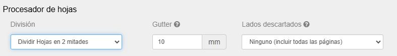
The output file would be like the following example:

A PDF with all the pages, each one 210×200 mm (half the size of the 400x200mm sheet + 10mm of gutter) Let’s note that these 10 mm added for the gutter correspond to the contiguous or previous page:

Furthermore, we have the option of applying the gutter not to the entire album, but only to the pages we are interested in
-
- Cropbox.
Area in millimeters that is added to the print to be able to add crop marks. - Mediabox.
The size of the Mediabox is automatic and adjusts to the crop area. - Output file.
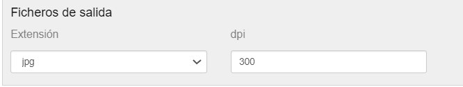
Output file format configurable in JPG or PDF (editable).
In the case of JPG, the output resolution can be selected in dpi’s.
Cliparts
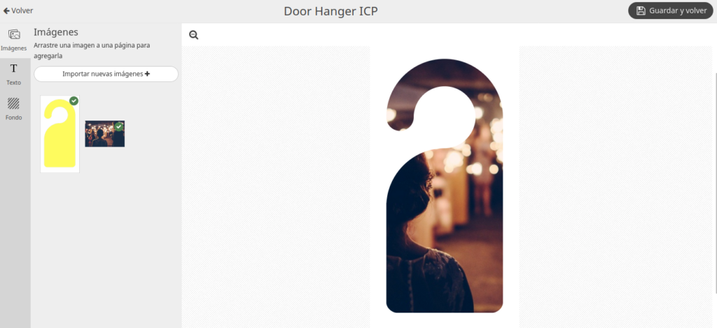
We have incorporated the possibility of adding cliparts to our Responsive Photobook editor.
Cliparts are predefined images that the user can add to their template to decorate it.
In this case, the end customer does not upload their own photo, but uses an image stored in our systems to decorate their project.
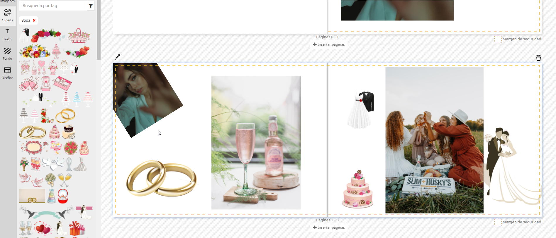
A good example would be to incorporate cliparts with a wedding theme into a wedding album product:
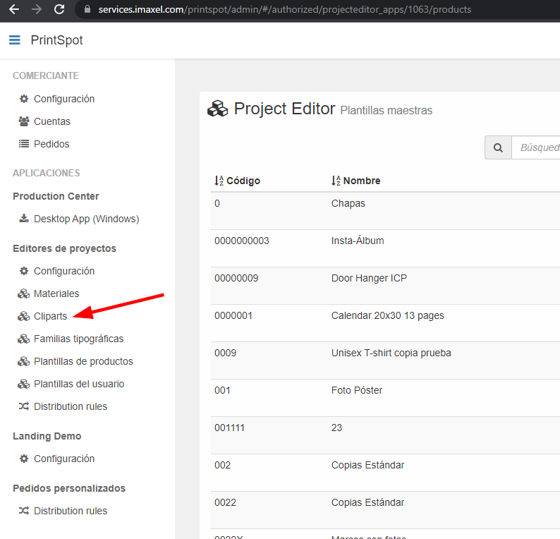
You have to access the template manager, you will see that a new Cliparts section has appeared in the Project Editors section:
When we access the Cliparts section we can see that they are differentiated into two: System Cliparts and Custom Cliparts:
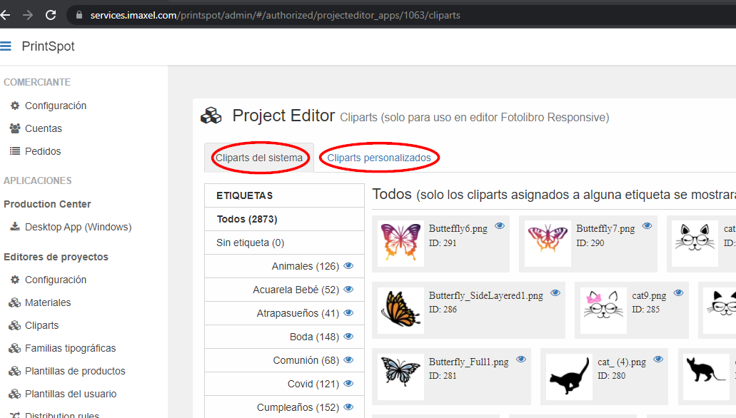
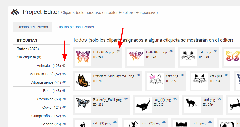
The System Cliparts are managed by Imaxel, they cannot be modified, but you can define the visibility of a specific tag/label or clipart using the eye icon that you can see in the following image:
In contrast, Custom Cliparts are managed by the administrator users of your Services administration panel.
In this section you can create your own custom tags and upload your own cliparts.
There is no limit to the number of tags or cliparts that can be uploaded.
Regarding the management of your own cliparts, there are three sections to take into account: management of your own tags, management of your own cliparts and the file uploader.
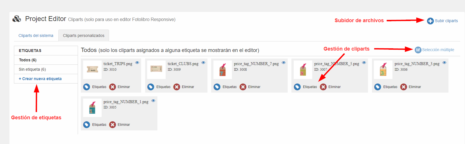
- Management of your own tags: by clicking on Create new tag you can define a new tag for your cliparts.
Tags are the way to group several cliparts into a single group, making it easier for the user to navigate between themes, colors or any classification that you consider attractive to them.
When creating a new tag, you can specify its name and its translation into multiple languages, as well as the selection of which existing cliparts will be grouped in this new tag.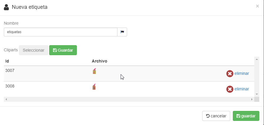
- Management of your own cliparts: with the Tags button you can specify which tag this specific clipart corresponds to.
With the Delete button, you delete the selected clipart and the Multiple selection mode allows you to perform bulk actions on more than one clipart at once, such as being able to delete all selected cliparts with a single button.
Upon entering this mode, all unselected cliparts will be shown in gray to indicate that they are not active in the selection and those selected cliparts will be shown in their normal color.
To exit this mode you just have to click the Multiple selection button again, this time with the icon changed to a cross.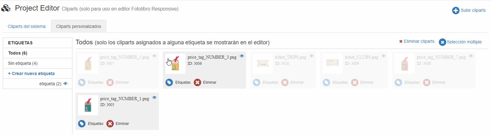
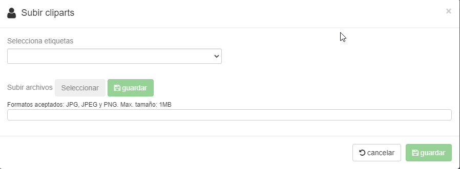
- File uploader: in the file uploader you can select several files from your computer at once to upload them all at once.
In this step you can already define the tag with which to group the new cliparts that you are going to incorporate.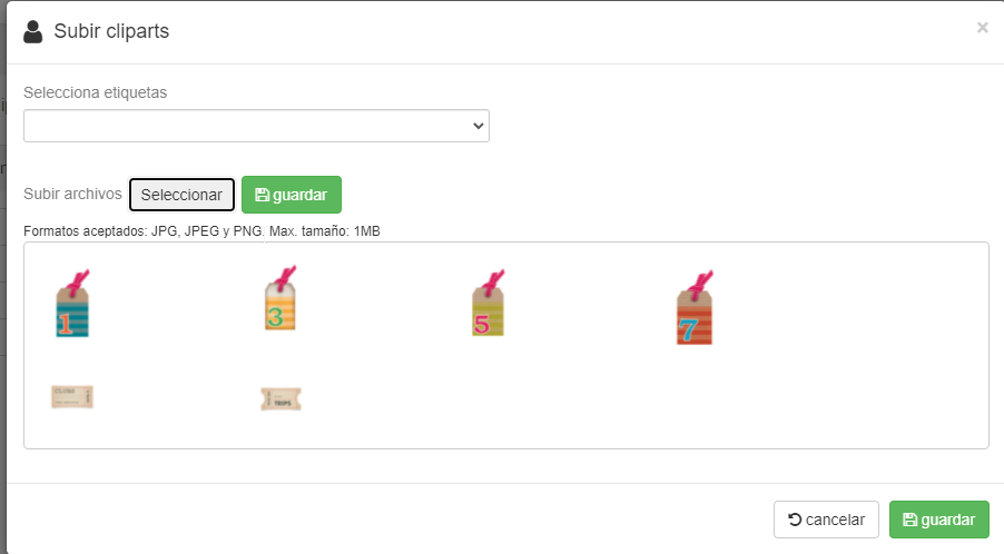
Editor (front-end)
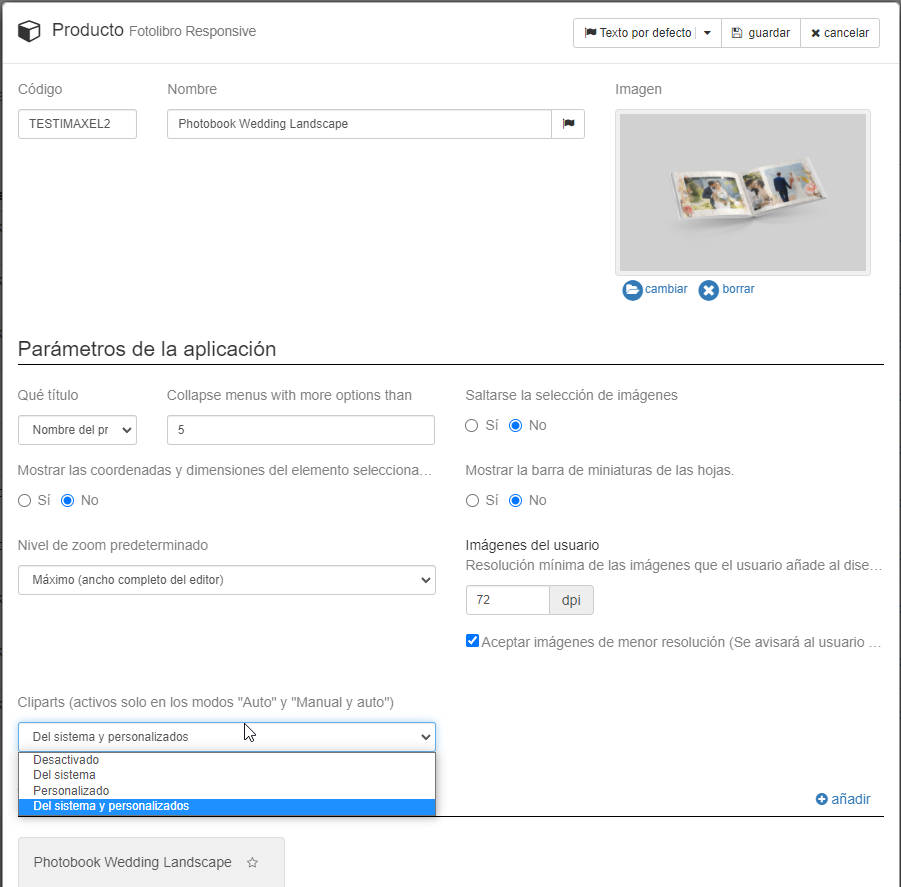
To use cliparts in your template you just have to edit it through the Services administration panel and enable the clipart functionality.
Once the editing window has appeared, you will see a new section inside the template called Cliparts.
By default, cliparts are deactivated for all templates, so you must activate them manually.
To activate them, you can choose between showing customers System Cliparts, Custom Cliparts (that is, your own) or showing both.
Once the cliparts are activated in the template, they will appear as a new section in the editor.
In it, cliparts appear grouped by their tags and a search engine to help customers search for a tag of interest: weddings, Christmas, Valentine’s Day, Disney…
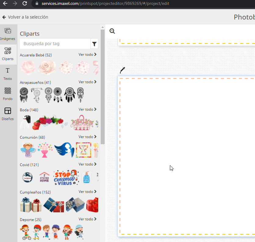
The customer just has to drag and drop the clipart they are interested in to incorporate it into the project, as you can see below:
It is worth noting that cliparts can be locked in a model just like the rest of the elements and that cliparts are treated as an independent element from the rest of the design elements, that is, the automatic content layout options do not affect them, but rather the user must always drag and drop them to incorporate them into their design.
As you can imagine, the possibilities using cliparts are infinite!, offer unlimited personalization to your customers with the use of this functionality!
FAQS
In what editor is this functionality incorporated?
The clipart functionality will only be available in the editor templates that use the Responsive Photobook module and within these in those that have the Content Layout configuration in Manual only or Manual and Automatic mode.
They are available for any type of component of the editing module (pages, cover, calendar or generic).
What file formats does the uploader accept? What is the maximum size it allows to upload?
The clipart uploader only accepts formats: PNG, JPEG and JPG with a maximum weight of 1MB.
This information is also available in the uploader itself: